Tuesday, September 22, 2009
Different layouts

Heres another layout style which shows a more organic pattern, not so presice. I like how the different sizes works together and draw you in from different distances. You look at each image individualy and also as a whole.
I have also pinned them up on a white wall as in the previous post I had them on a grey floor which wasn't an accurate representation of how the presentation would look. The walls in my space are white. Having the white backgrounds of the images merging with the wihte of the walls makes the framing of each image more confined to the shape of the images I have made. This brings attention more to the images rather than the white blank on the surrounding paper.
For a final presentation this layout would be significantly larger as it has to fill up the space somewhat.
Layout ideas for prints
Wednesday, September 9, 2009
Tuesday, September 8, 2009
Quick mock up of possible site installation
Wednesday, September 2, 2009
A Drive to the Cape
A better Version video driving to Cape Reinga, the northern tip of New Zealand. All stills are taken off Google Maps.
Tuesday, September 1, 2009
Driving around
Heres a bit of experimenting playing with google earth and driving to popular places i.e Cape Reinga. Another way or Virtually travelling around the place on the internet.
I later realised that I could get rid of the line and arrows and stuff but its just a little practice exercise.
I later realised that I could get rid of the line and arrows and stuff but its just a little practice exercise.
More google iconic icons......city spaces
This might be my Site Space
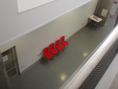
At the moment I have been given this space. Its the big wall outside the new 152 lecture room. Just a big white wall with not much on it. I will confirm it asap so I can start analysing the space and thinking about what I can do with it. Its a nice wall anyway, its new, big and has good lighting.

(I just found out that I don't have this space anymore but I think I am in the life drawing room with Viet, I will update as soon as I know and add pics)
This is the life drawing room that Viet and I are possibly exhibiting in for site. I would take the far right corner and Viet would take the left hand wall with the middle wall left empty. Theres alot of crap in here that makes it look cluttered but with out it and with a few windows covered there is a few nice walls waiting to be covered. Nice natural lighting and big space would be good for big works.
Subscribe to:
Comments (Atom)


